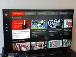
YouTube rolling out fresh interface for Android TV

YouTube's new Android TV interface is now rolling out, hopefully solving some of the issues people have reported that have led to a pretty horrid rating for the app in the Play Store. The new interface makes it a bit easier to browse on a big screen with some larger interface elements and new tabs running across the main home screen. That's all roughly the same, though, with the core of big tiles showing off videos sitting on top of a grey background remaining intact.
The video player interface is probably the biggest change that everyone will experience. Bringing up the UI over the top of a video is far less intrusive, letting you see more of the video when you bring up the scrubber and previous/play+pause/next buttons.
YouTube surely hasn't addressed every complaint, but there are lots of improvements here.
The seek bar is activated with a press up on your remote, where you'll now see a sequence of thumbnails from the video as you scrub through. When you highlight the previous or next buttons instead, you get a lineup of videos below the scrubber that will be coming up next when you press the button — far better than a list of suggestions. At the end of a video, you get a few second buffer to see what's coming up next (if you have auto play turned on) rather than immediately jumping to the next video in the lineup.
The update obviously can't address everything people were asking for with YouTube on Android TV, but getting our first major update in a year shows Google isn't completely forgetting about the platform. Grab the update on your Android TV box and enjoy the latest interface.
Be an expert in 5 minutes
Get the latest news from Android Central, your trusted companion in the world of Android
Andrew was an Executive Editor, U.S. at Android Central between 2012 and 2020.

