Waze gets a big and bright design update as people start traveling again

What you need to know
- Waze has updated its iOS and Android apps with a colorful design refresh.
- Users will find more expressive cons, thicker lines, and more color sprinkled through the app.
- There's also a new Moods feature for sharing your emotions.
Waze is giving its app a colorful and fun refresh today. It's rolling out a slightly refined design that includes a new font for its logo and more expressive icons through the app.
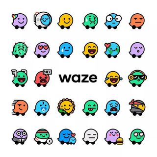
With this new update, it has added a set of 30 expressive Moods to the app, so drivers can capture just how they feel on the road. It's not clear how this will help in the core function of the app, but Waze seems to think it's a good idea.

The Waze Team explained the philosophy behind Moods on Monday:
The fundamental idea of Moods has always been the same: to reflect how users feel on the road. We had a lot of fun exploring the range of emotions people feel out there. A dozen drivers could all feel different in the exact same situation, so we set about capturing as many of those feelings as possible. This was critical to us, because the Moods act as a visual reminder of all of us out there, working together.
Other than that, Waze is still as Wazey as you'd expect, just with the added color and the expressiveness of these (certainly not-at-all-distracting) new Moods.
The new update is rolling out to the App Store and Play Store.
How to download offline Google Maps to your phone
Be an expert in 5 minutes
Get the latest news from Android Central, your trusted companion in the world of Android

